Think like a brand strategist, design like an agency, and build like an engineer — one person doing what usually takes three, accelerated by AI. I don’t write the message, but I make sure it lands: visible, credible, and executable at a level that matches the ambition behind it.
“I’ve brought Shannon in on six or seven different projects and that’s really the whole story — when you find someone who gets it time after time and doesn’t need hand-holding, you keep going back.”
Michael Weir, Fractional VPM
Akeana Filtered Pivotal Plex Quiet Platforms Spring Free EV
Every project starts somewhere. This could be where yours starts.
Embedded Creative + Technical Partner for Marketing Teams
For teams already in motion — scaling past the point where consistency happens by accident. I learn the brand and the stack, then work at the pace the team’s already moving.
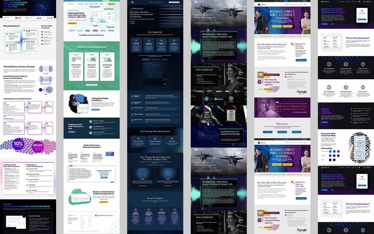
I work across the whole picture: brand identity and extension, web design and development, print, display, sales and marketing collateral, presentations. If it carries the brand, I can build it or design it.
One person across all of that beats a handful of specialists, because nothing gets lost in a handoff and nothing drifts when priorities change mid-project. The brand stays itself, no matter which channel it’s in.
Contract, fractional, or full-time. I’m not particular about the structure — I care about the work.
AI Speeds Up Execution, Not Judgment
Faster, stronger, smarter, deeper — AI is an important tool that has become part of the craft, intricately woven into the process. Time-consuming research now happens in seconds. Image editing, background swaps, color changes, added elements and more happens in a single prompt instead of a full pass. Code gets written and debugged at a different speed entirely.
Judgment matters more than speed, though. When something breaks, AI helps trace the real answer faster, but deciding what it means and what to do next still comes down to experience. The same holds for staying current. Things shift constantly. AI keeps that knowledge current instead of a year stale.
Once a visual language is established, AI can learn it. The low-end, repetitive production that used to sit in a queue becomes something anyone can do themselves, on-brand, without the wait.
“The new design was a leap forward in visual language. It resonated with exactly the enterprise names we were trying to win.”
Joey Greenwald, CMO, Enboarder
Enboarder Filtered OwnID
Your clients are out there. Let’s build a brand that reaches them.
Marks built to last — most are still working years after launch. Click any one for the story behind it.
“I’ve worked with Shannon on several projects. I call him the big brain, because he thinks so deeply about design, and always impresses every client. His work is clean and well structured. A true professional, Shannon will set the bar for design in any company.”
For more than twenty-five years, I’ve worked at the line between what a brand should look like and what it actually needs to do — as a designer, a developer, and as the person responsible for running the whole business.
My early years as an entrepreneur and my time as partner and COO of a WordPress software company still shape how I think. Not directing from the sidelines — actually making the calls: team, priorities, the operation itself. I’m not just asking whether something looks right. I’m asking whether it moves the business forward, because I’ve sat on that side of the table.
I get marketers because I’ve worked beside them for years — the deadlines, the pressure, the shifting priorities, and the need to make something excellent without slowing the team down.
I’ve been making things since before I had a name for it, and I started building for the web early enough that technology became part of how I create, not just a tool I use. That mix is still how I work: curious, hands-on, strategically minded, comfortable moving between brand, code, marketing, AI, and people.
Design isn’t the finish line; it’s how you get to one. Good design looks great. Great design accomplishes something. I’m looking for teams that need creative judgment, technical fluency, and business sense to show up at the same time.
Project, problem, or just a hunch? Tell me what you’re working on. If I’m a fit, we’ll figure out next steps. If I’m not, I’ll probably know someone who is.
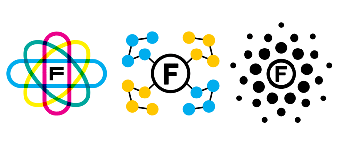
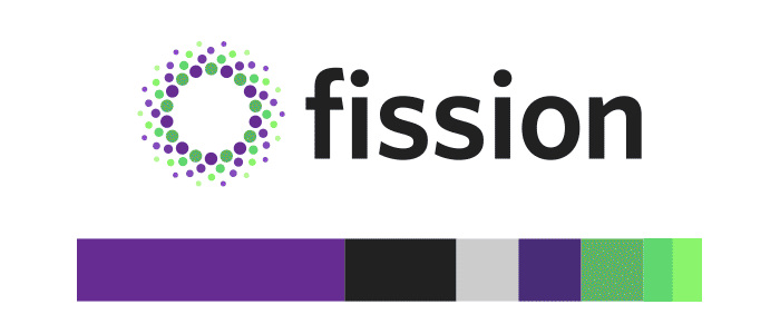
Open-source serverless framework for Kubernetes, created at Platform9
Created 2017 · Still in use · Logo + palette
The Ask: Platform9 needed a logo for its new open-source project. The brief was basically “here’s what it is.”
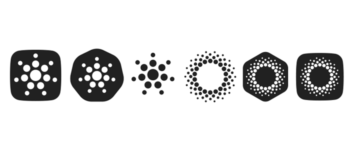
The Idea: I wanted to expand my ideation, so I collaborated with two more designers on concepts, not polished logos. The name itself was an obvious starting point, but I also wanted hints of containers and Kubernetes. The client chose options to explore, and I added one more I couldn’t let go of — a humble dot cluster. It evolved and rose to the top: simple, catchy, and evocative.
Nine years later, still their logo.
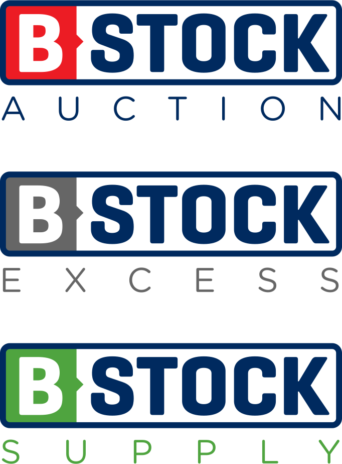
B-Stock Primary Blue HEX: #002a5f
B-Stock Solutions Blue HEX: #195194
B-Stock Auctions Red HEX: #ec1c24
B-Stock Supply Green HEX: #4fa43f
B-Stock Excess Gray HEX: #666666
B-Stock Primary Blue HEX: #002a5f
B-Stock Solutions Blue HEX: #195194
B-Stock Auctions Red HEX: #ec1c24
B-Stock Supply Green HEX: #4fa43f
B-Stock Excess Gray HEX: #666666
B-Stock
B-Stock is a B2B liquidation marketplace for major retailers and brands
Created c. 2010 · Still in use · Logo + sub-brand system
The Ask: A fast-growing company signing big-name retail partners needed a brand that looked as established as the companies it worked with. Two rules: blue leads, and the mark has to carry multiple sub-brands.
The Idea: “B” and “stock” wanted separation, but a dash was the easy answer. A notch cut into the B block does the job instead — part arrow, part index tab, pushing the read forward into the name. The blue frame holds the brand while the B block changes color per sub-brand. “Stock” always sits on white, so it works on any background and in black and white.
Fifteen years on, the sub-brands and “Solutions” are gone. The mark isn’t.
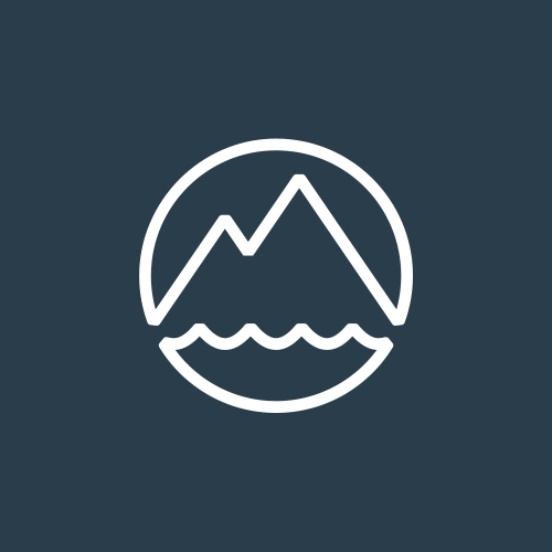
Land + Sea Coffee
Wholesale coffee, sourced on the road
Created 2022 · Logo
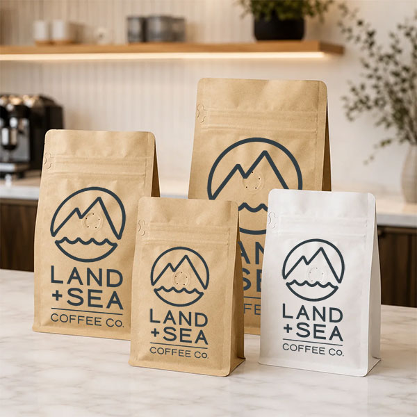
The Ask: Arun, surfer, skater, traveler, board shop owner, found a coffee sourcing partner on his travels and started a wholesale coffee business. He wanted a mark that matched the name, carried his personality, and looked good on a bag and swag.
The Idea: Round one: put the whole name in one badge with mountains for land, stripes of sea, and a coffee bean rising as the sun. Round two stripped it down to a peak and a wave in a circle. It’s simple enough to stamp on a bag, a cup, or a sticker, and versatile enough to grow past coffee.
My third logo for Arun, after his board shop and a wakeboard community.
TGPR
Content and PR for modern tech companies
Created 2015 · Still in use · Logo + website
The Ask: Kevin Wolf had run his PR firm since 2002 without a logo. A new website was the moment to fix that — no real brief, just a straightforward need for something that worked.
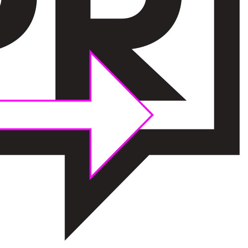
The Idea: Some ideas come fast. PR is the business of being heard, so a speech bubble immediately came to mind. I pitched it in our first conversation. Developing the logo further revealed the R’s leg and the bubble’s tail share the same angle, mirrored, and the space between them points forward. Serendipitous! A speech bubble and an arrow in one mark.
Eleven years later, it’s still his logo and I’m still his designer.
1983-2007
2007-Today
GDCA
GDCA keeps discontinued embedded computer boards in service for defense, aerospace, and industrial programs
Created 2007 · Still in use · Logo + brand system
The Ask: GDCA’s logo dated to 1983 and said nothing about the business or its global reach. The new mark had to stand beside companies like Emerson and Rockwell Collins and earn the trust of engineers who distrust polish for its own sake.
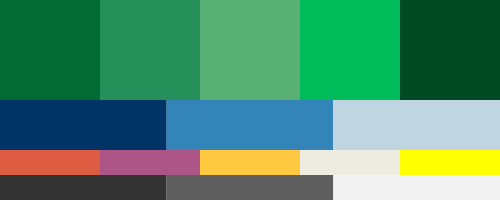
The Idea: The Tracer Ball. Circuit traces wrapped around a sphere say “computer boards” and “global” in one mark, and the traces angle upward like lines on a growth chart. It holds up as a detailed 3D globe and as a flat favicon. Oblique letterforms in a modified Geogrotesque add forward motion without getting flashy.
Nineteen years later, still the mark — and I’m still directing the brand.